
Master Bedroom By EDesign
We are going to need to start talking about things you can be doing if you are planning to take advantage of the spring housing market by getting your house up for sale (things are heating up!). I thought I would squeeze in a peek at one more room in our house before we switch gears. I am forging ahead with sharing the different spaces in our home in the interest of helping you visualize it as a whole. Once we start brainstorming ideas for the remodel, I'll need your understanding of the space to be strong when weighing in on decisions. By the way, Felt is now on Pinterest if you are interested in following along with inspiration I'm pinning for the remodel....like this kitchen that had me drooling over the weekend.

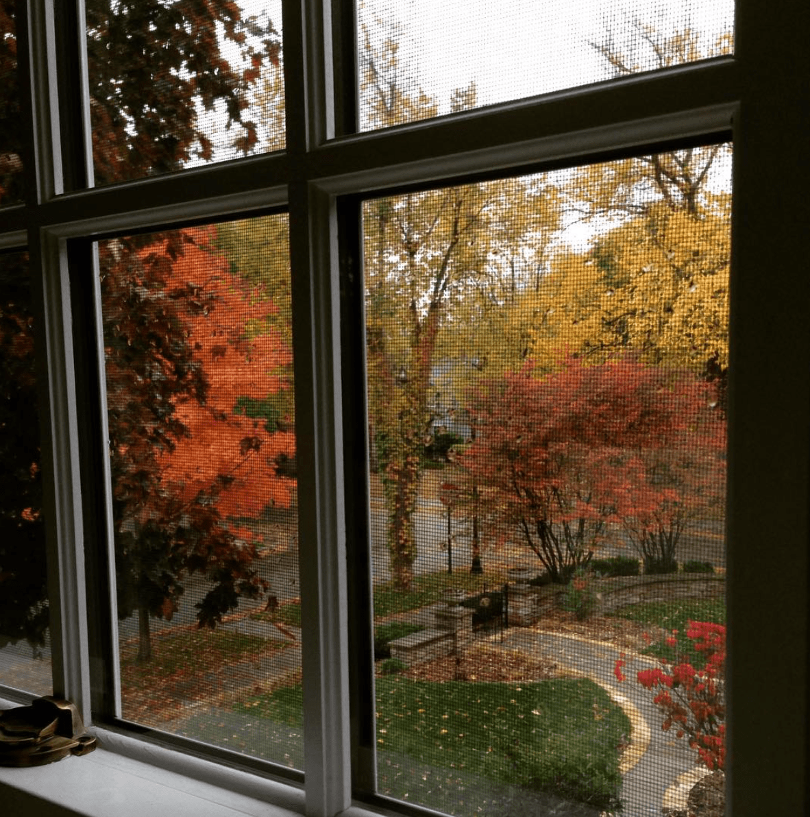
Back to our Master Bedroom. This room sits perched all the way around our upstairs open banister at the end of the center hall. It looks out over the front yard and street and along the South side of the house (here was a pretty snap taken out our bedroom window this Fall).
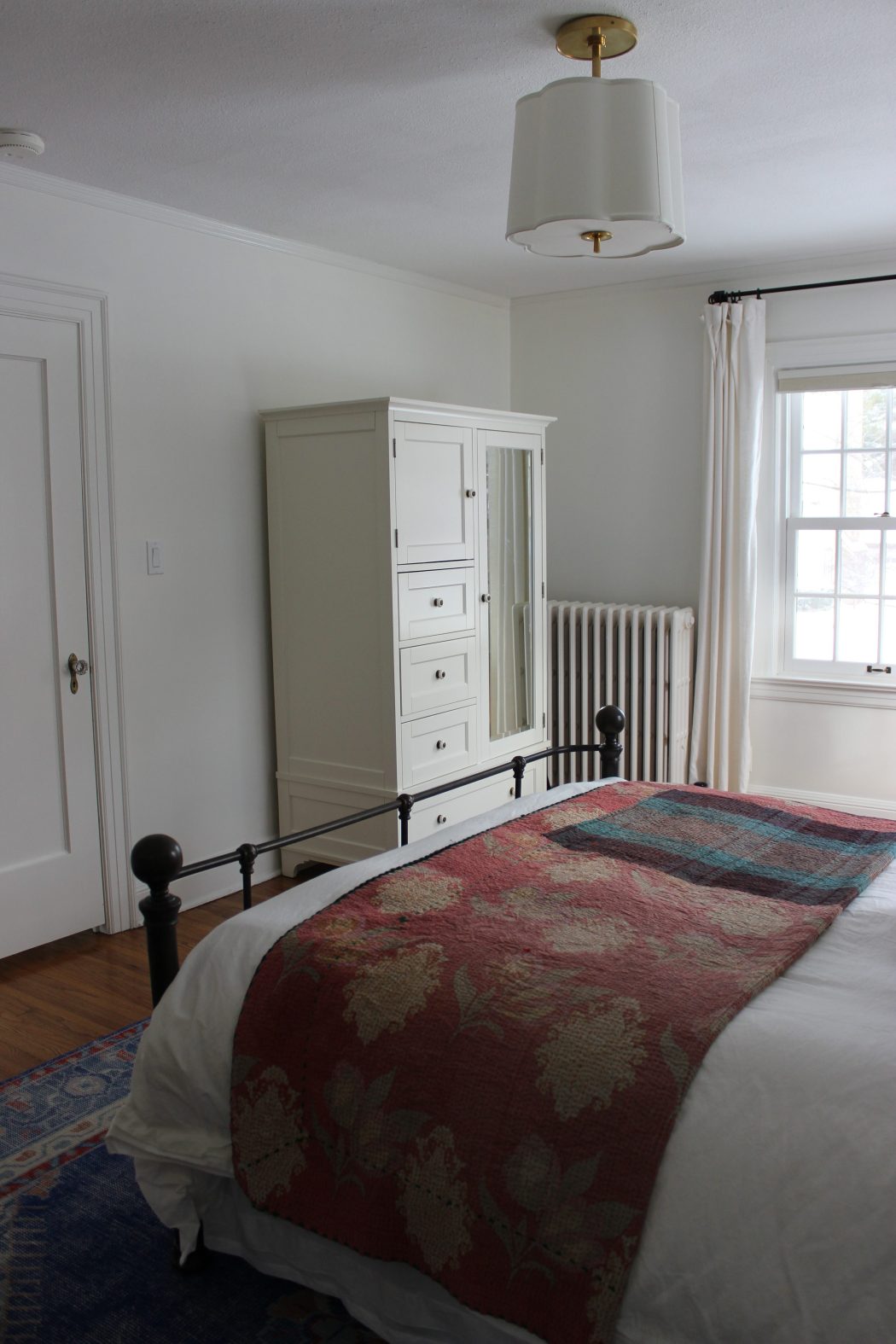
It gets amazing natural light most of the day. I don't know the exact history on how the closet came to be but it does have an adequate size walk-in closet. It isn't huge, but it's certainly sufficient by old house terms. The closet walls are made of drywall (rather than plaster like the rest of the house) which means the space was manipulated at some point (likely when the master bath was updated).
The room features three original single panel doors with original brass hardware (one of which is mirrored). It has original wood floors throughout that match the width and finish of the main level floors. The same thick window casing and baseboards are carried throughout the room and the picture rail molding that runs between the walls and ceiling adds extra charm. The room is 16' x 12' - not huge, but adequate in size for us.
When we moved to the house, there wasn't much that needed to be done to this room (this photo from when the home was previously for sale).

There were a few elements that felt out of place - the dark woven window treatments and the oil rubbed bronze ceiling fan both had a more modern feel to them than the bones of the house. There were additional wood finishes in the master bathroom that tied into these darker fixtures that pulled the room together as a whole, but in a different direction than we preferred. It was a simple project to take the shades & ceiling fan down and bring the room back to its original condition. We replaced the woven shades with Duette honeycomb shades by Hunter Douglas that visually disappear when they are in their upright position.
We brought a considerable amount of furniture to this room from our previous bedroom - here is the photo of our master from our previous house, you can see the full Better Homes & Gardens spread here.

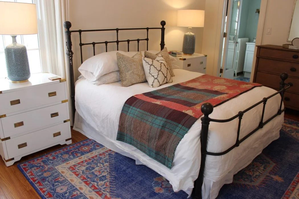
Our bed, armoire, dresser and nightstands all made the move to our new house but similar to our living room, just felt unfinished when placed here (remember the rug wasn't ours to begin with?). We were in desperate need of a rug (nothing colder than your bedroom echoing), lamps, overhead lighting, curtains and just a general pulled together plan for the space.
I have long been a fan of Studio McGee (you can take a peek at her work on her Instagram feed here). Her subdued designs full of texture and rich hues made her really stand out to me.

Studio McGee and many other of your favorite designers on Instagram often offer eDesign services. Are you familiar with this process? You initiate the relationship by filling out a questionnaire on their site. In it you are asked about the room you would like designed, how you use the space, your wishes/wants/desires for the space. From there you submit photos of your room along with dimensions and wait patiently to hear from a designer. Typically there will be emails exchanged between you and the designer where you sort of collaborate on your end vision for the room. Often you create or share a Pinterest board where you've pinned inspiration for the room. Maybe you have a light fixture that you want to be the centerpiece of the room - tell them about it! With some designers, an intermediate mood board will be created to insure the designer is on the right track with your design.
I decided to take the plunge and work with Studio McGee's eDesign services to help make some selections for our Master Bedroom. I specified with the designer I worked with that I would be keeping all of the furniture but was open to replacing the bedside tables. They had a bit more of a traditional feel than I was going for - I felt like the room needed an element of glam to it. The process went similar to what I outlined above. It's really up to you the amount you want to be involved in the process - some people would prefer just having the room done without any contribution on their own part, others might want to be involved in each decision made. I found myself somewhere in between, often sending a late night email to the designer with another idea or technicality. For instance, the scope of work for our remodel includes the addition of another bedroom (or two?) We currently distribute 3 bedrooms among 6 people. Therefore there is a great possibility that when we do remodel, this room will no longer be the Master bedroom. For that reason, investing in custom drapery for the windows felt like too big of a commitment. Unsure if they would transition to a tween's room (should a new master be added) or if the windows would be manipulated in size or location for one reason or another - I just felt like store bought panels were going to be a safer choice at this point, so I specified that with the designer.
After a few weeks, I received an email that included a space plan, a budget and an elevation of my room. The space plan was an aerial view of my room with the suggested furniture arrangement. The budget was an itemized spreadsheet with hyperlinks to each suggested item for the room from artwork to accessories to pillows and lighting. It included pricing, sizes, descriptions, links, finishes and fabrics. The elevation was a sort of mood board looking visual with each item in the room placed as it was being suggested.
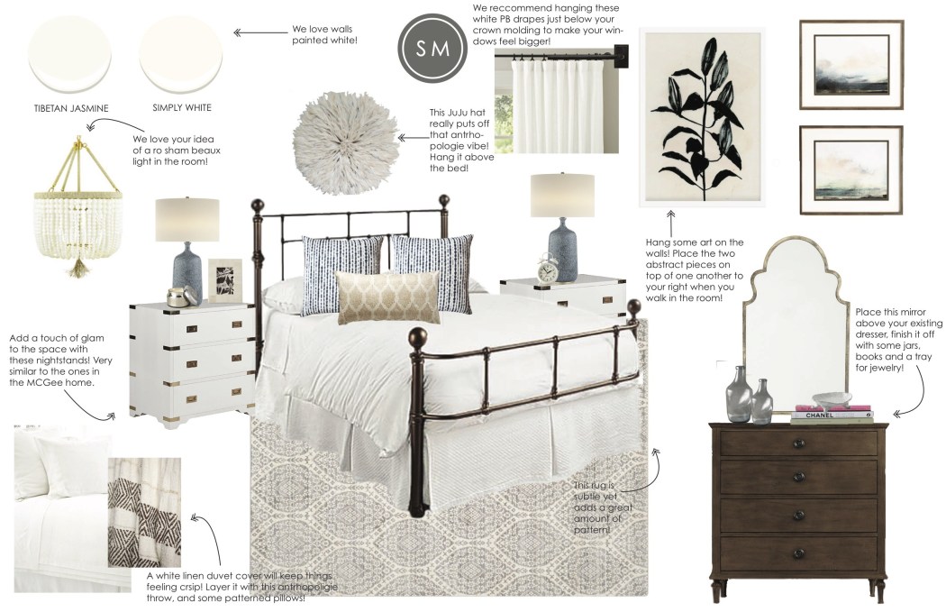
Receiving this email is obviously the most fun part of the process - seeing your room for the first time - a sort of 'virtual reveal.' From this step, you have a chance to go back to the designer for a round of revisions. In my case, I opted to have them suggest a couple additional rugs. I find rugs to be hard to commit to. They pack such a punch (or not) in a space that really sets the mood for the room. The original rug they suggested was really muted and with the other punches of color going on throughout the house (like the pillows in our living room or the rug in our office) I wanted to continue the trend in our bedroom.

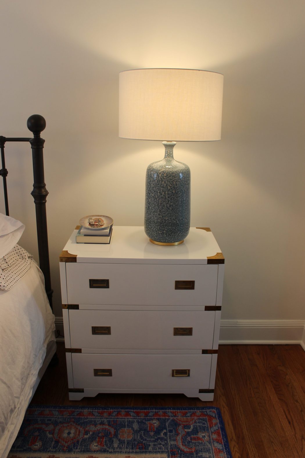
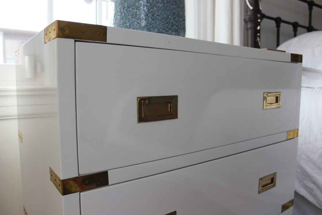
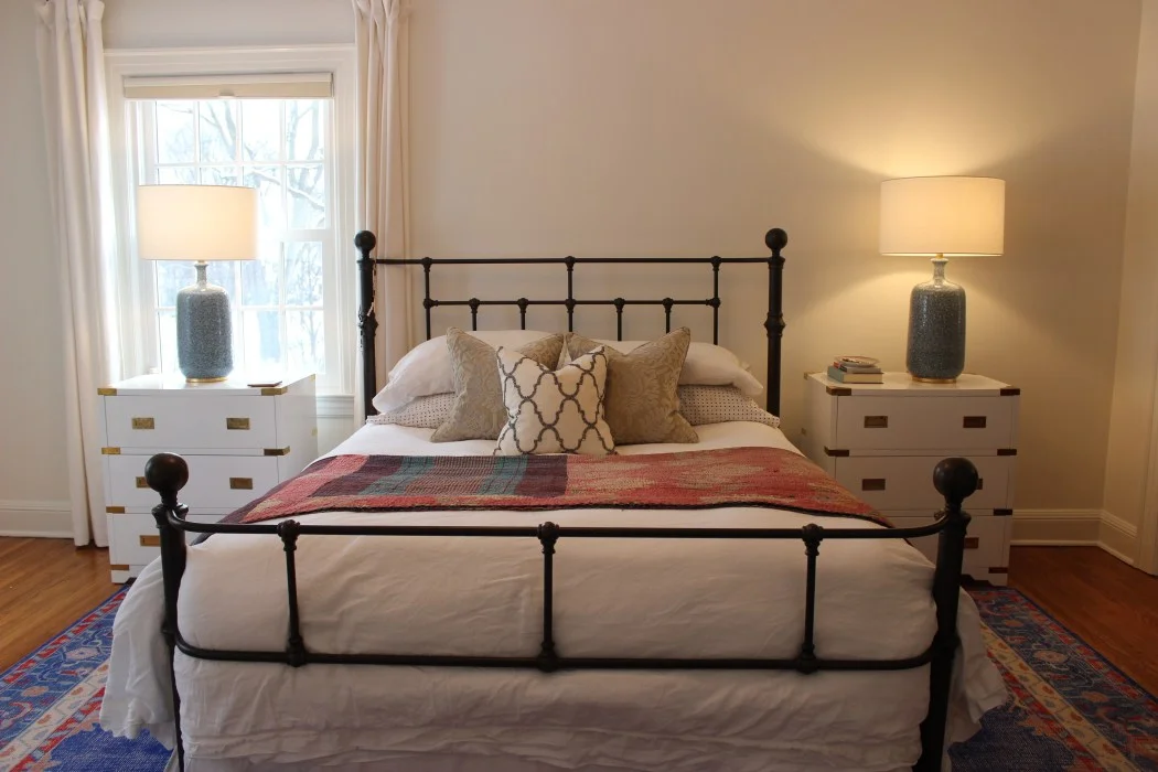
I was instantly in love with the lighting they suggested (the lamps are amazing!) Lamps can be so difficult to scale properly in a room. When I took these out of the box, they were HUGE! But once they sat on the gorgeous lacquer campaign nightstands they suggested, they felt right at home.
I have long been a fan of the rug they suggested, but never considered it in this color way. I love the vintage feel of the rug even though its brand new.

The mirror over the dresser probably made the biggest impact in the space by visually drawing your eye up to the high ceilings in the room.

It has a substantial presence without feeling heavy on the wall. The fact that it reflects all the natural light pouring in is just icing on the cake.
The vintage Kantha on the bed is something I already owned (and loved) purchased from one of my very favorite stores locally, Victory.

Studio McGee suggested a different throw for the bed but this one is still working for me so I opted not to change it out just yet. It's also a perfect weight for cozying up with if you aren't interested in completely bedding down for the night. The drapery panels they suggested are a Studio McGee staple - simple, white, linen and lined. The lining allows the panels to hang with a bit more presence than unlined and they give a layer of warmth and softness to the walls.

Through my process of eDesign, Studio McGee also suggested artwork for the walls, accessories for on top of the dresser and nightstands, pillows and a bench that will sit in the corner between the two windows. I'm planning to move ahead with the bench and pillows but feel like artwork is a more intimate process for me to select. I have a few artists in mind that I'd like to see on the walls in here, I'm excited to share more about them in an upcoming post.
For now, the room lives like you see it here - fresh and bright with a blend of soft and saturated hues.

While I wouldn't call the room finished just yet, it is a calm oasis away from the chaos of daily life - a retreat we look forward to sinking into each night. I must say the process of eDesign was fun and I would encourage you to look to designers you already know and love for their suggestions on your own space. I'll feature more designers I follow who offer eDesign in a coming post as well as a peek at our master bath and closet.